My blog has been moved to GitLab, only old posts are shown at dingwell.github.io
Please, no more jet
When I wrote my bachelor thesis in 2009, I was a big fan of jet, the go–to colormap for many scientist. I guess a big reason why it ever became popular was that it was the default colormap in matlab. In addition, it’s quite pretty to look, unless you actually want to understand your data that is. The truth is, there are plenty of problems with jet, perhaps one of the most well known is the problem with colourblind viewers.
During my master project (2010) I experimented a bit with different colormaps; when you do that, you soon realize that changing the colormap can have a huge effect on how you interpret your data. Furthermore, if you print your figures in grey-scale, the differences are even clearer.
Grey scale readable
Two year ago, while working on paper for my PhD, I came a accross a blog post by Jake Vanderplas where he provided a python function to return “luminance–correct” grayscale version of any given colormap. It turns out that many of the default colormaps shipped with matplotlib (or any other visualization tool for that matter) are quite bad at highlighting important patterns in your data.
This is probably why Mathworks decided to replace the default colormap “jet” with a completely new one, called “parula”, in the 2014b release. The new colormap solves many of the problems which the more “traditional” colormaps have.
Perceptually awesome
The developers of Matplotlib released four new perceptually uniform colormaps, with the 2.0 release. Nathaniel Smith held a great talk about colormaps at SciPy2015 (you should really check it out!); where he explained the concept behind perceptually uniform colormaps and why you should use them.
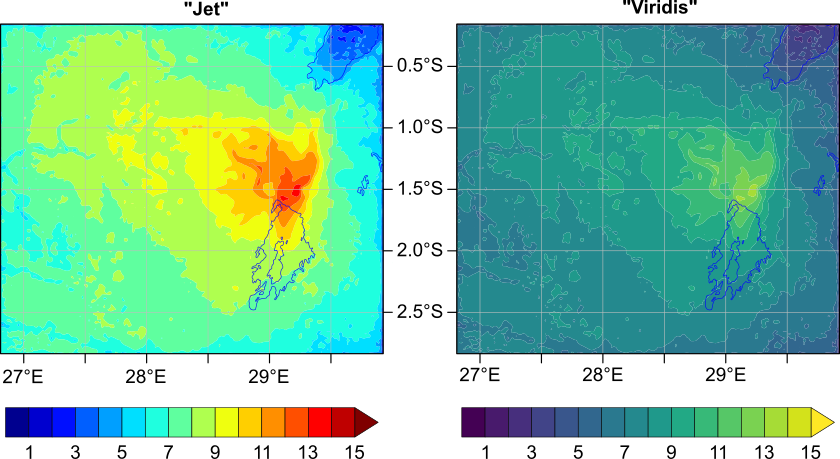
As an example, take the picture below, it shows the same data plotted with two different colormaps; the left figure uses the (still very common) “jet” while right figure uses the new default colormap from matplotlib. Notice how the part that stands out most in the left hand figure is the yellow/green somwhere in the middle. You get a completely different impression from the the figure on the right, there is not really any part which stands out more than the rest and you can easily find the extreme points.
 These figures were made using the NCAR Command Language (NCL),
so I had to export the colormaps to rgb-lists.
In case you want to use the new matplotlib colormaps in NCL,
you can find them here:
| Viridis | Plasma | Magma | Inferno |
These colormaps have 254+2 colours (2 are reserved for foreground/background).
You can install them by placing them under $NCARG_ROOT/lib/ncarg/colormaps/
or, if you prefer,
put them anywhere you like and set your environment accordingly, e.g.:
export NCARG_COLORMAPS=$HOME/ncl/colormaps:$NCARG_ROOT/lib/ncarg/colormaps
A final word
I am truly grateful that someone finally put some serious work into colormaps. However, “jet” will probably live on for a couple of more years since habits are hard to break, even for scientists. So please, do everyone a favour, and inform your peers/teachers/students that there are better alternatives to ‘jet’ and the other traditional (or should I say ‘old-school’?) colormaps.
Update May 3, 2017: Now also for ncview
ncview
is a handy tool for quickly visualizing netcdf or hdf data.
A nice thing abount ncview is that it allows you to add your own colormaps,
so I exported a set of 256-colour versions of the maps as well:
|Viridis|Plasma|Magma|Inferno|
Install these by copying them to /usr/share/ncview or put them
anywhere you like and set your environment accordingly, e.g.:
export NCVIEWBASE=$HOME/colormaps/ncview
Enjoy!
Subscribe via RSS
